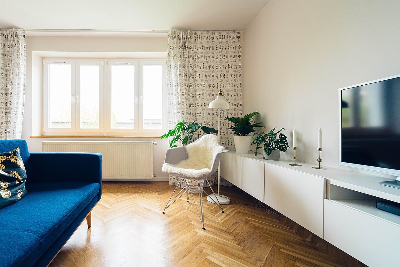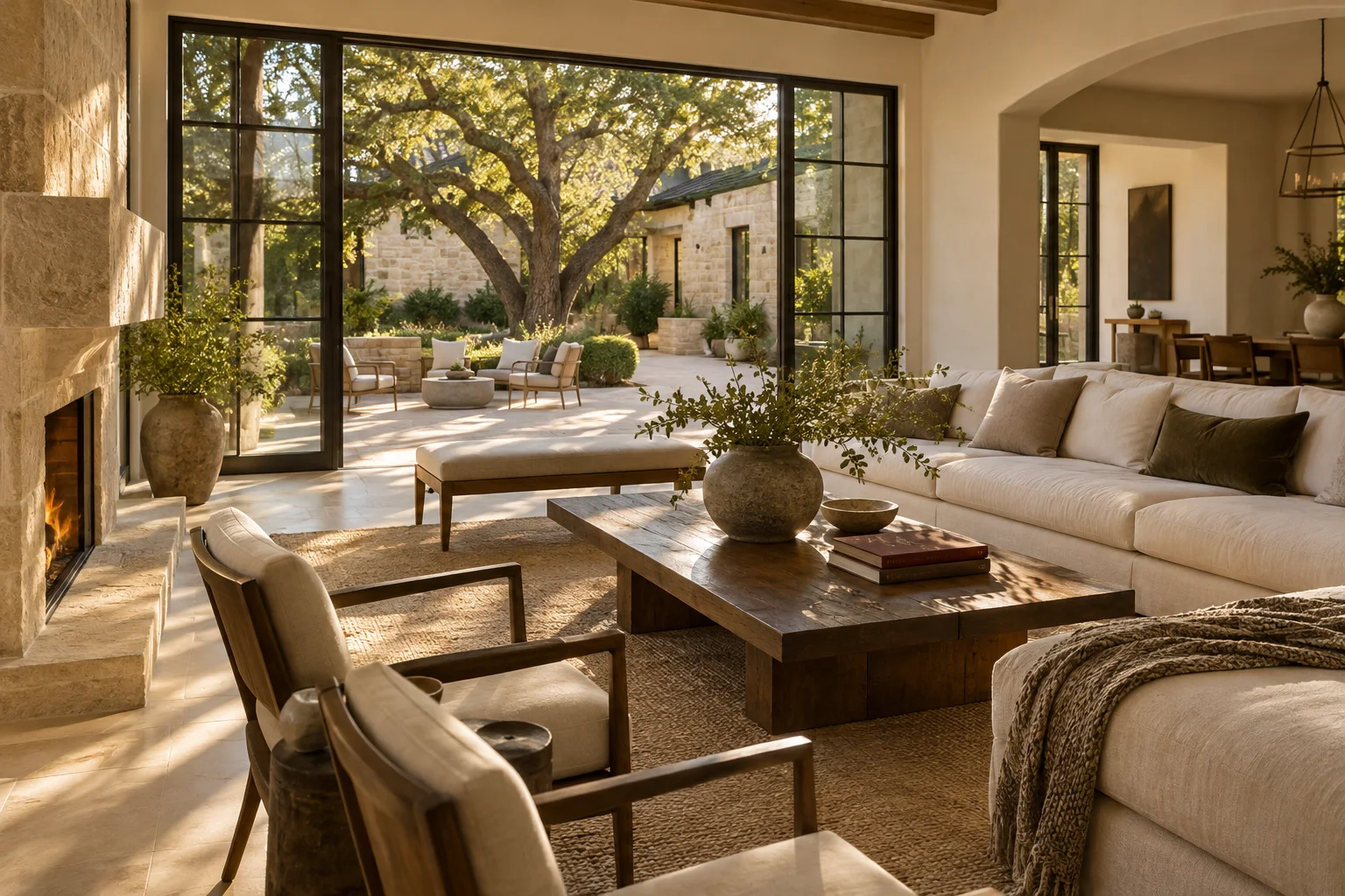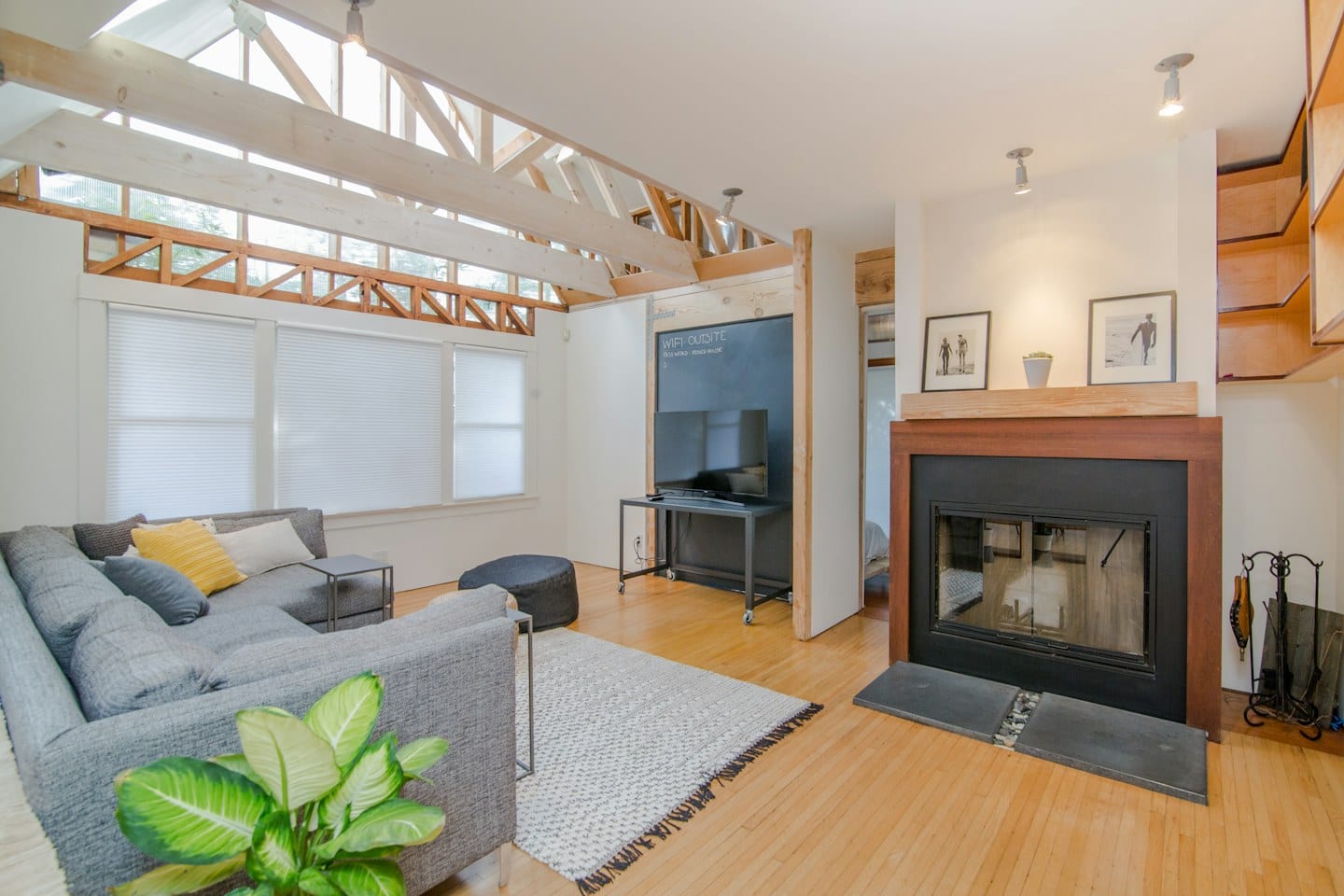
A small swatch of color on a white card rarely tells the whole story. When you hold a sample up against a wall, the surrounding environment—the floor, the furniture, and even the ceiling—immediately begins to influence how that shade appears to your eye. To make an informed decision, you must move the comparison from the store to the specific room where the color will live.
Marking Your Progress
The most common mistake in color selection is losing track of which sample belongs to which shade once they are out of the original packaging. As you collect various options, create a dedicated labeling system. Use a permanent marker on the back of the sample cards or the edge of the painted boards to note the specific name or code. This prevents the frustration of realizing you have fallen in love with a shade only to find you cannot identify it later.
Keep a physical log or a digital note of these labels alongside any other design notes you have collected. Having a centralized place for these identifiers ensures that your planning remains organized as your palette evolves.
The Impact of Shifting Light
Light is never static. A color that looks crisp and bright during a mid-morning sunburst might transform into something much deeper or more muted by the time evening settles in. To see these changes, place your labeled samples in several locations within the room. Lean them against different walls or tape them near windows and in darker corners.
For example, if you are reconsidering a bedroom color because you recently changed your bedding or moved a large piece of dark wood furniture into the space, the old samples may no longer be relevant. The new furniture might absorb light differently, making a previously bright shade feel suddenly heavy. Testing the samples at different times of the day allows you to observe these shifts firsthand.
Evaluating the Tradeoffs
Selecting a color involves a meaningful tradeoff between how a shade looks in isolation and how it performs within a complete room. A color might be a perfect, singular choice, but it could clash with the existing undertones of your flooring or the natural light coming through your windows.
As you observe your samples, ask yourself how the color interacts with the elements you cannot change. Does the shade make the room feel smaller or more expansive? Does it highlight or hide the texture of your walls? By viewing the samples in situ, you move past the initial attraction to a single swatch and begin to see how the color functions as a component of your living environment. Once you have observed the samples through various lighting conditions and alongside your existing decor, you will be better prepared to finalize your choice.